Propel
Propel is a web and native app platform with the mission to enhance students experience while in university by connecting them to work and networking opportunities. For many, the first job out of university determines a person’s career trajectory.
Team
Sheena A, Julene S., Alex W. & Myself
My Role
UX Designer, Prototyper
Client
Propel
Industry
EdTech
Tools
Figma, Miro, Google Docs, Google Survey, Zoom
Timeline
1 month
The Problem
Canadian university students often don’t have a plan for work during and after college. What they do is go to career-centers at their university, or apply directly to organizations using job search engines. We looked at student’s perspective on the job market to understand if there are underlying issues.
Underlying issues:
Student loan debt
The work force (especially due to COVID)
Belief in their own abilities
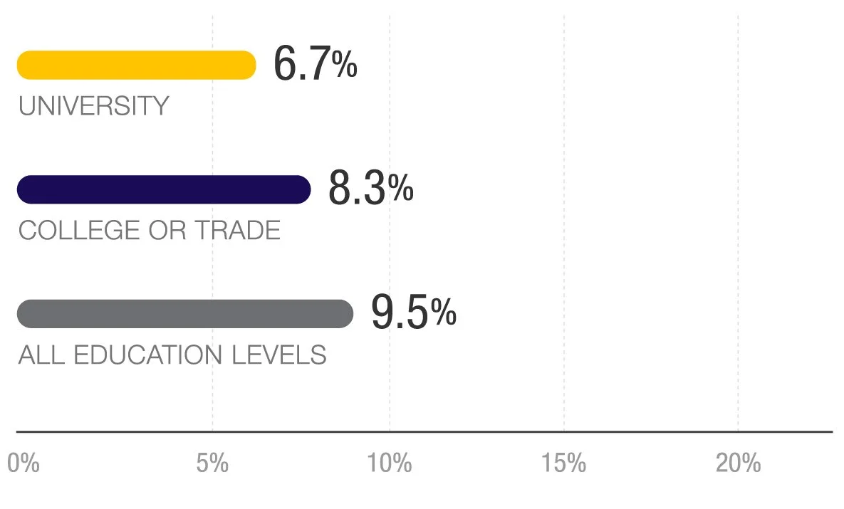
Canadian Unemployment as of 2020
Goal
Propel wants to amplify:
Students connection with hiring managers
Ability to join clubs and attending events to increase student skillset
Students autonomy in their future career trajectory
Propel has 2 distinctive users: University students and Employers.
My team focused on the student profile, for this project, as they are the primary user.
Why does this matter?
Students are in control of the types of roles they can apply to.
Having the best work fit for both students and employers. Double win.
How can Propel increase user sign-ups, and job conversion rate?
Discovery
Competitors
LinkedIn
Offers both a mobile and desktop platforms that’s used for professional networking, career development, and jobs.
Handshake
A job platform for American university students to connect to their career centers and peers.

WayUp
College students and recent graduates find jobs and internships that fit their experience.
Strengths
Easy onboarding especially for Handshake, a total of 2 screens. LinkedIn, although a long onboarding (more than 15+ screens) was easy to follow.
Handshake and WayUp are tailored for college students and recent grads. Handshake focuses on the student’s curriculum - extracurricular activities, classes, projects and any other experience the student is participating in to expand their skills.
Weaknesses
Unable to filter specific content to view on the home screen.
Areas of Opportunities
Issue: Unable to filter what content to view on the home screen.
Opportunity: Give the user the opportunity to choose what they want to see more of.Issue: The handshake app has recruiters message students directly with job opportunities
Opportunity: This feature can be incorporated to lessens the job search efforts.
Research
Secondary Research
We looked at the clients prior user testing reports to understand students frustrations and needs.
Findings >
Passively job hunting
Intimidated by job titles
Need
guidance
Aware they
lack experience
We wanted to understand:
What matters the most to students when looking for work.
What frustrates and delights students.
What type of information would students like to receive from clubs and organizations.
User Research
We surveyed 8 Canadian students ages 18-20 years old from various majors and stages in their university career.
Affinity Mapping
The clients research and our own was compiled, and we found a couple of the same patterns.

Recurring Themes
1
No work
experience
KEY INSIGHT
Students are lacking confidence
2
Personalized
platform
KEY INSIGHT
Build approachable, friendly design geared for non-business, tech and engineering students
3
Message recruiters
KEY INSIGHT
Build a relationship to leave a lasting impression
4
“Interesting“ jobs
KEY INSIGHT
Leverage soft skills and hidden talent(s) to widen work opportunities

User Journey
To understand how Sadie would go through the app we assumed she would have setbacks due to her feeling overwhelmed by her lack of experience. Knowing this we can design a very simple onboarding process with minimal step to get her exploring other screens.

Persona
The insights helped create the user persona. We named her Sadie. Having an idea of who the user is helps empathizing with her needs, wants and frustrations when using the propel app.
How Might We
build college student’s confidence and get them work they want.
Develop
Sketches
Sketches helped in understanding how Sadie would interact from the onboarding stage onto the home screen. We added elements we found from the research she would want to see and push her along to explore the discovery screen. This would give her the confidence boost and belief of having the tools to get the work experience she wants.
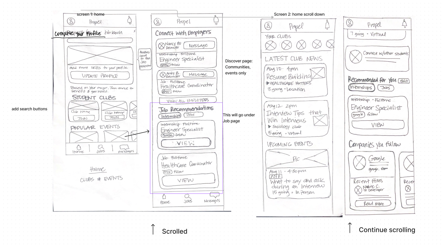
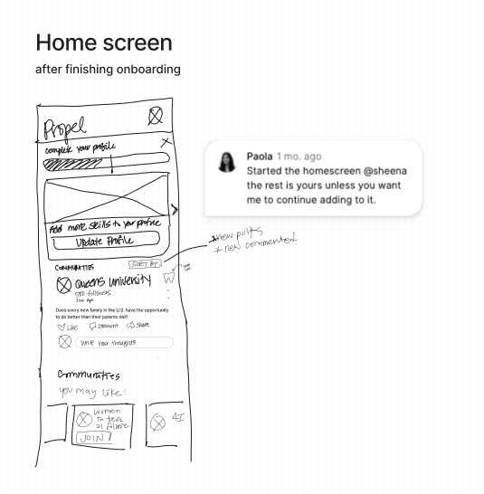
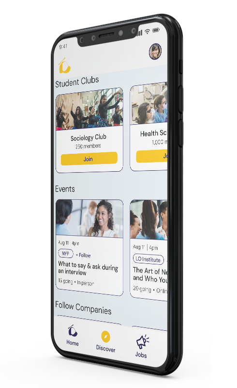
Home & Discovery Screens
In the Communities screen, Sadie can follow posts and discussions to build rapport with others, and also be updated to what the latest news she follows. Sadie can join clubs, and attend events. This network will ensure a stronger resume when applying to positions she wants and is qualified for.
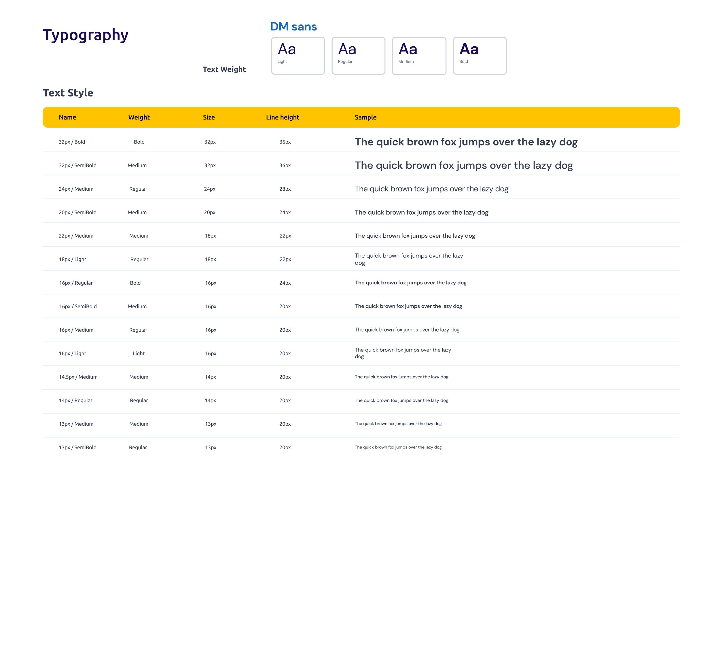
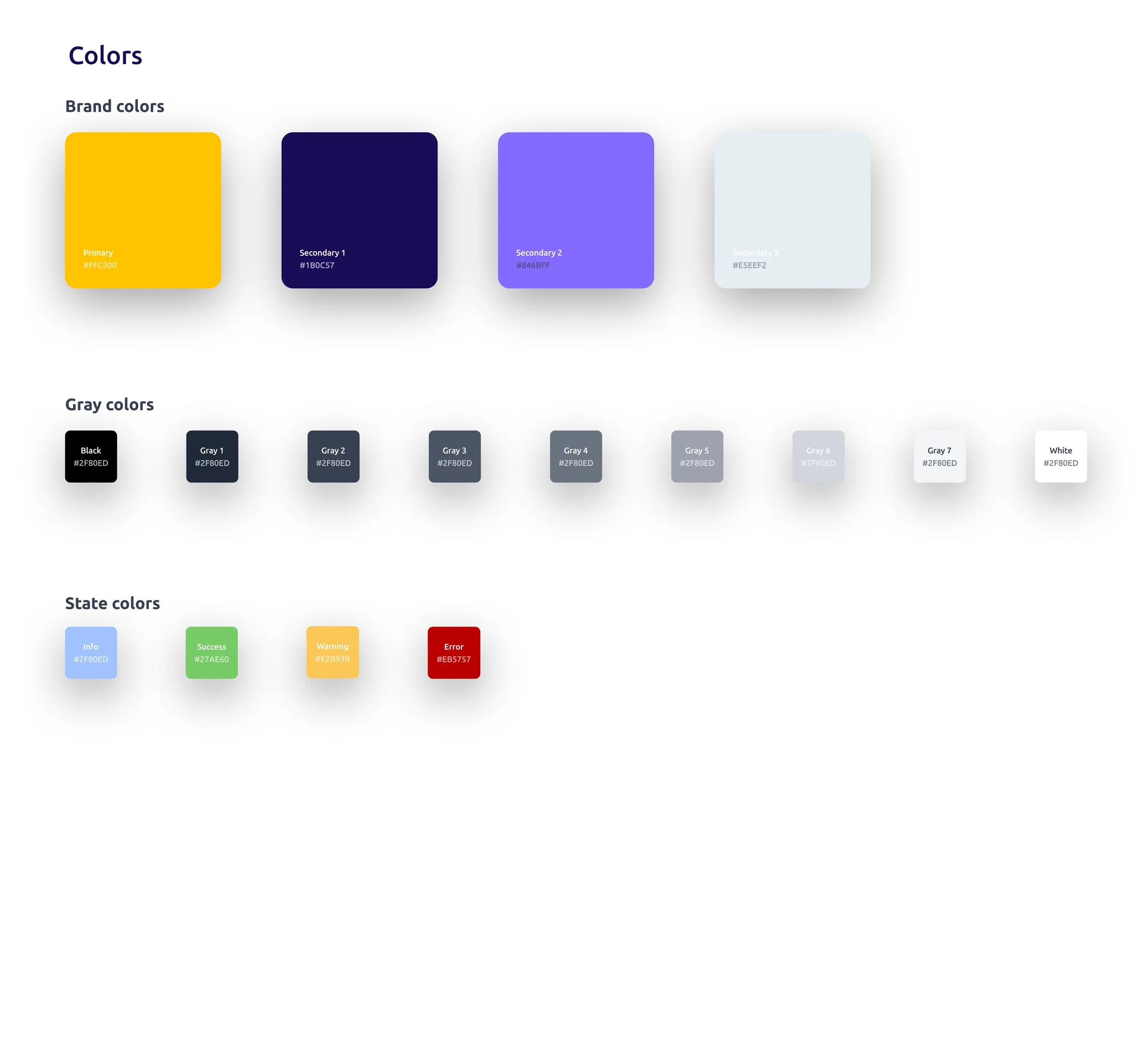
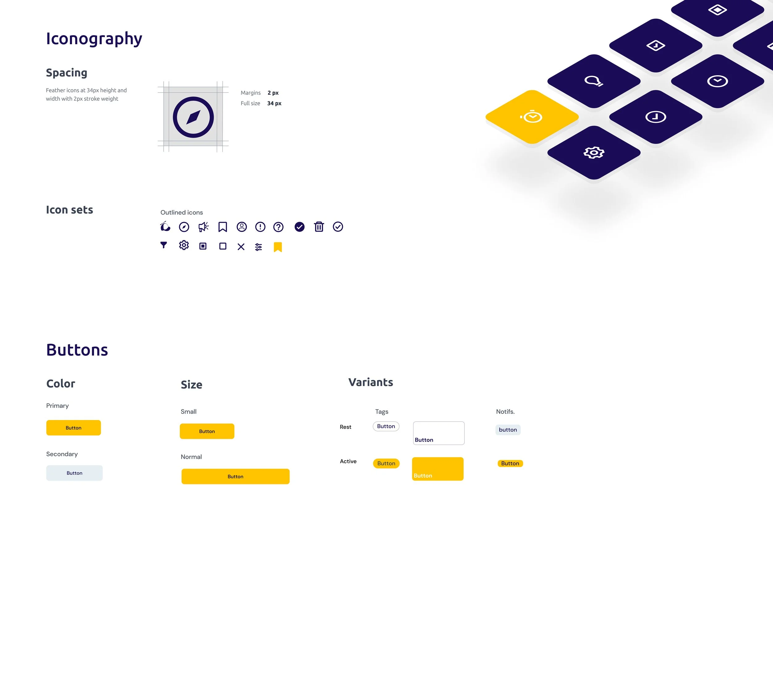
Styleguide
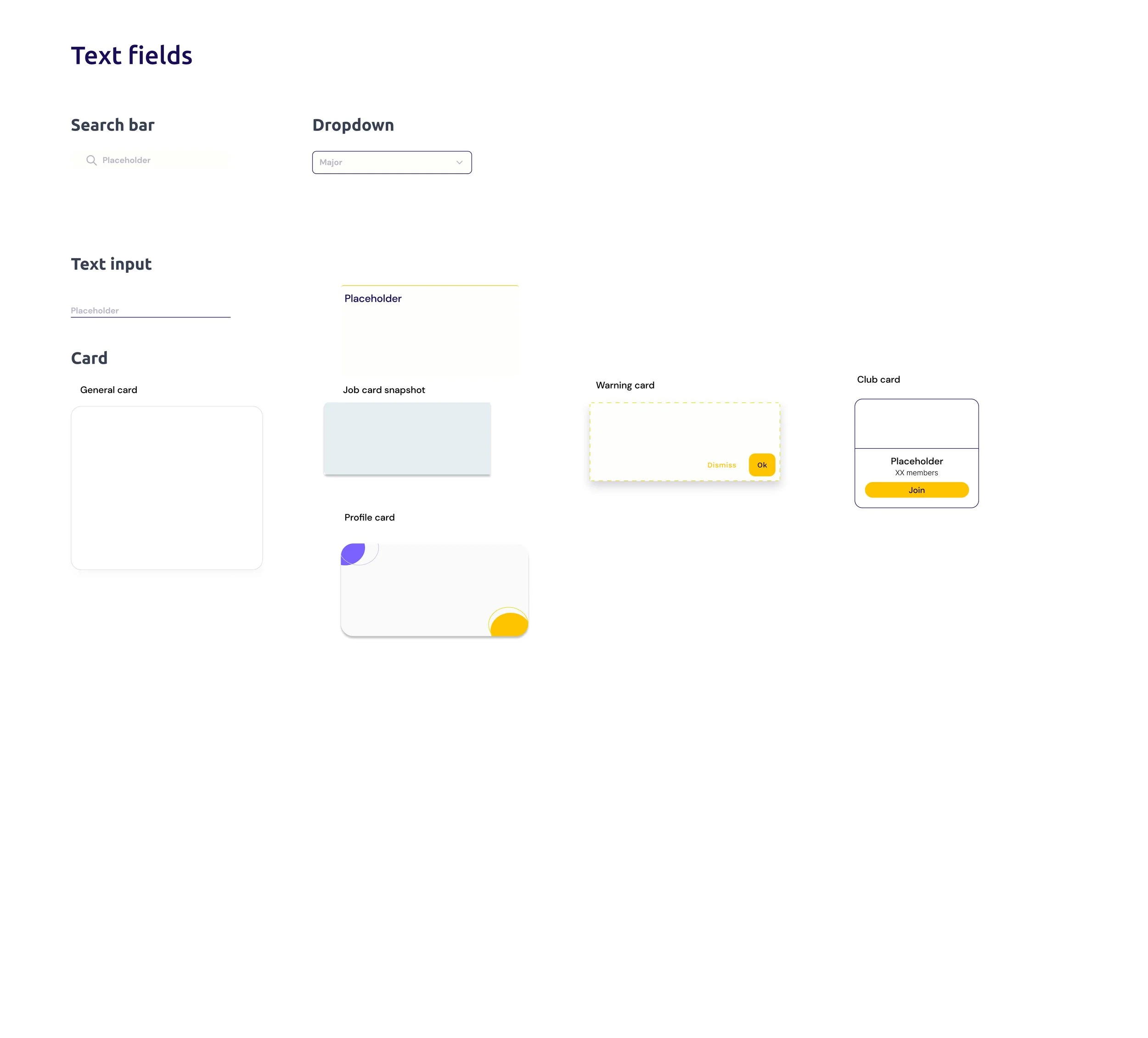
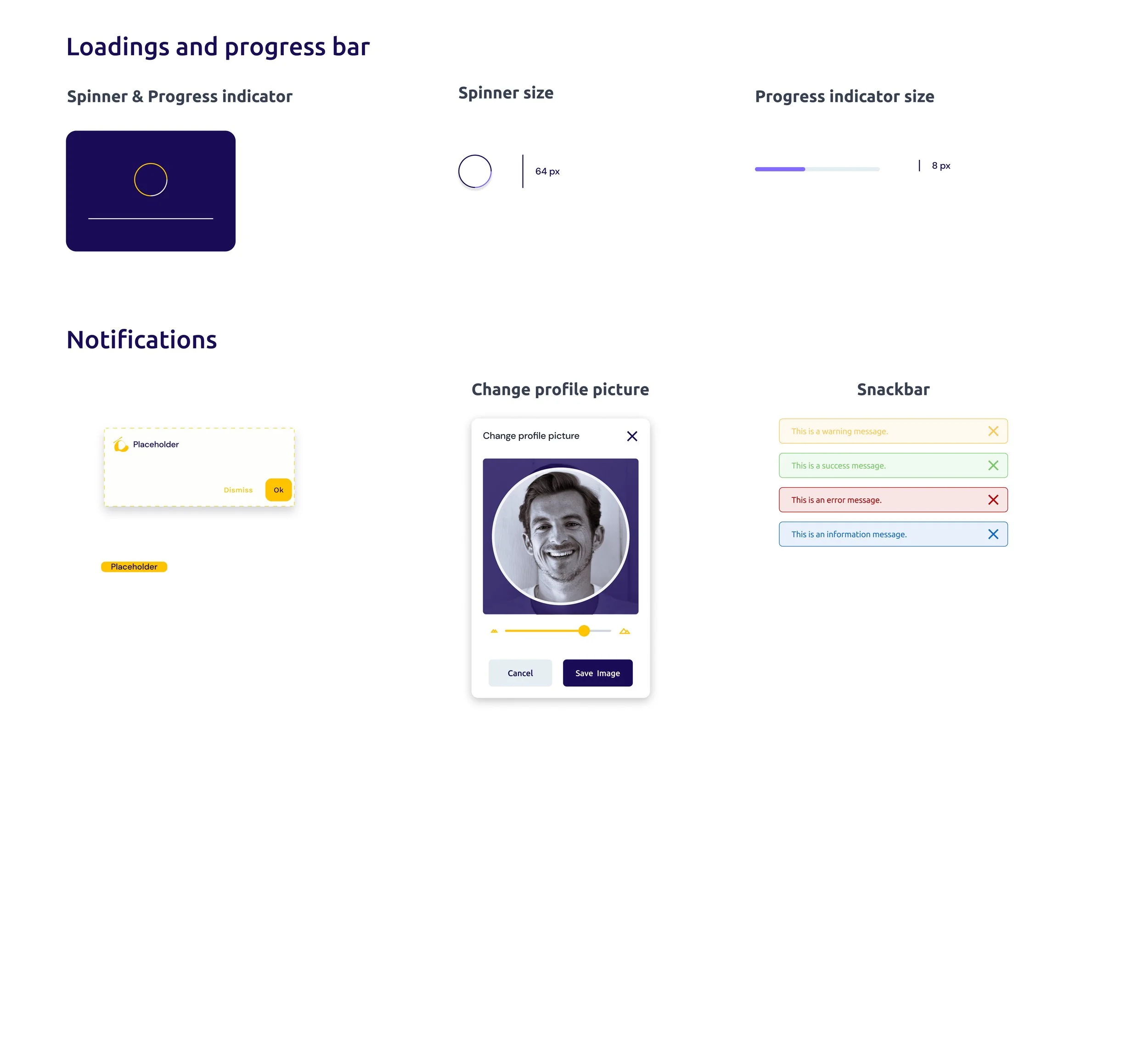
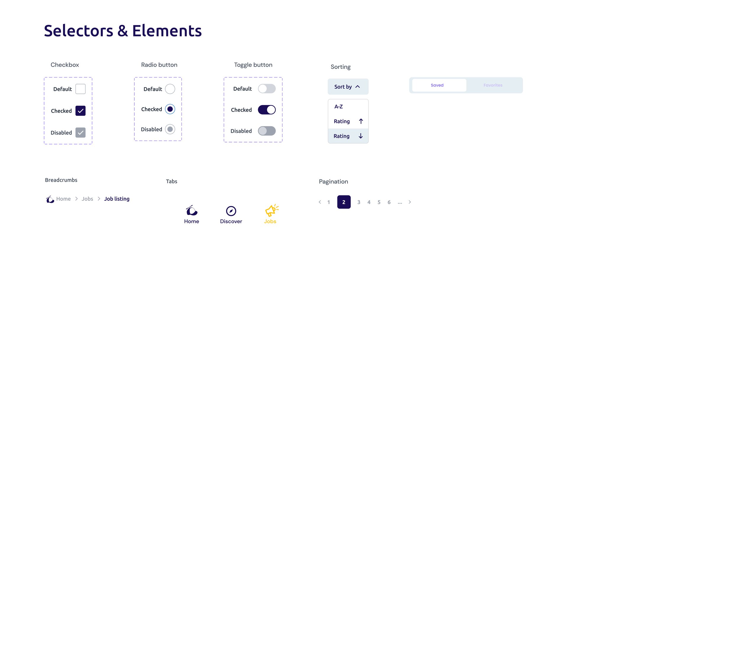
Wireframes
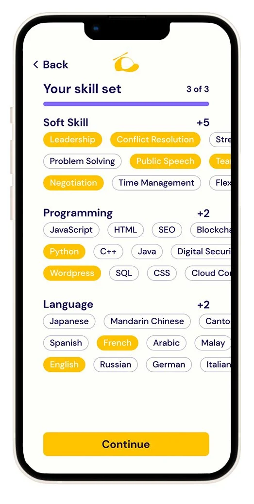
Onboarding - Add “other“ skills
Adding other interests and soft skills widens the job pool.
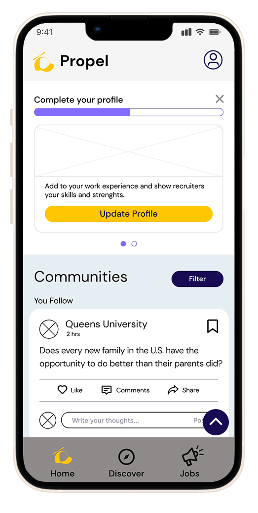
Home & Discover
Home screen posts clubs and events followed by Sadie, and also show suggested clubs, events and companies she can explore.

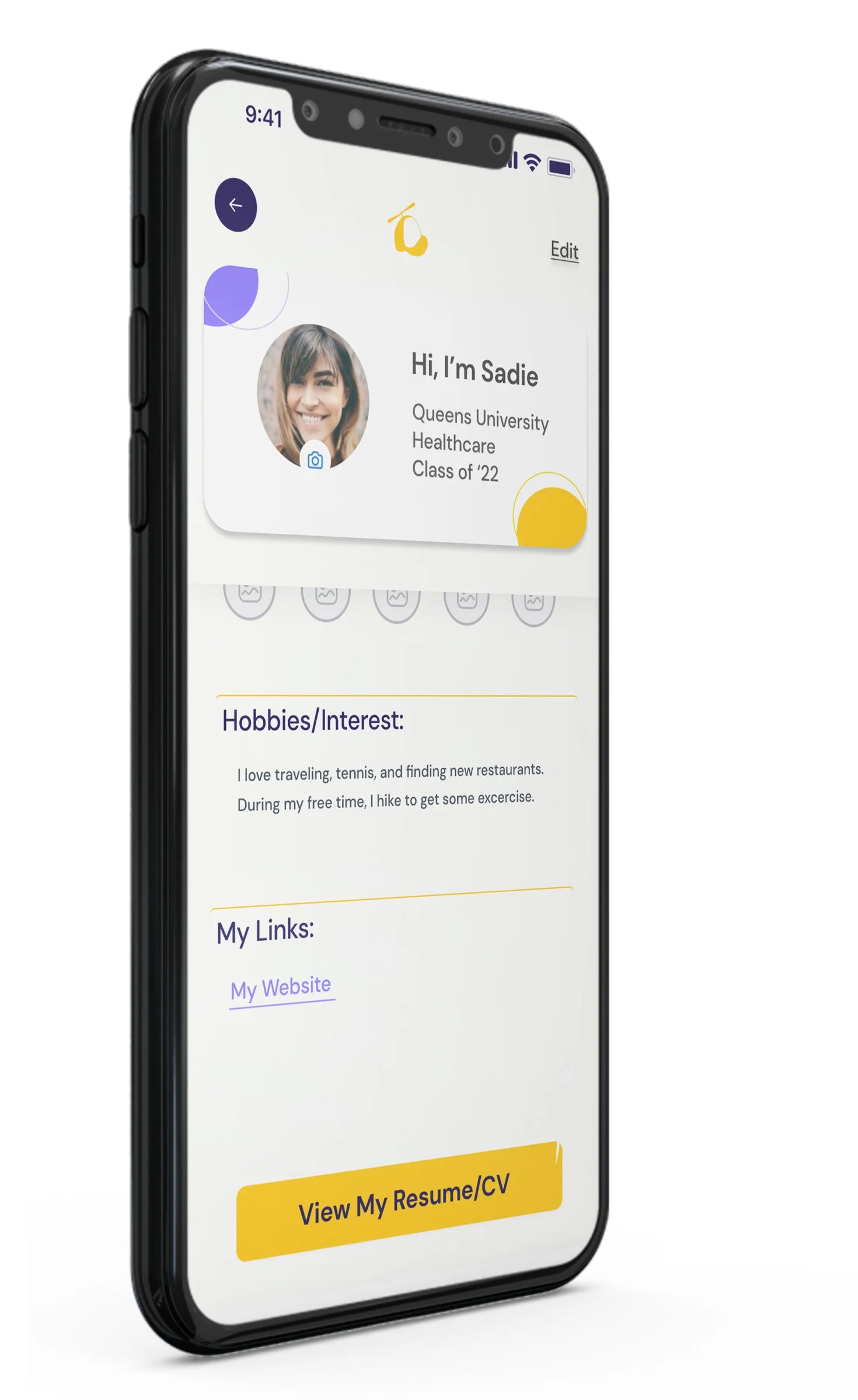
Profile
Adding skills and any other information that can boost and make Sadie’s resume stronger.
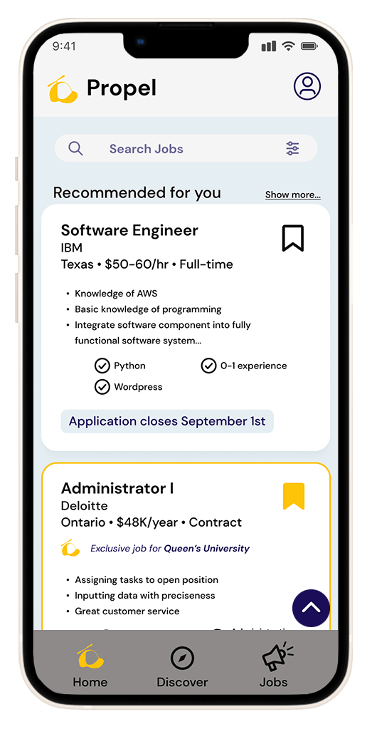
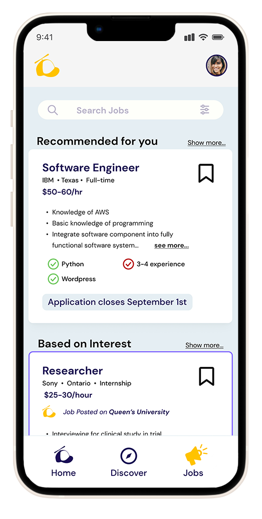
Job posts
Search for jobs Sadie qualifies for she’s interested in.
Usability Tests
3 participants had moderated interviews
20 - 27 years old range
1 was within the target user
2 of the students are a part-timer, and a graduate student
2 are currently looking for work, and 1 is employed and a part-time student
Main Issues
1
2/3 participants wanted to see job posts and updates on the home screen that matched their skill set.
Possible Iteration
Under the filter feature give a wider range of options for the user to choose what posts they want to engage, be it looking only at job recommendations or, club posts, for example.
2
All participants mentioned they wanted to add skills and experiences on the profile page.
Possible Iteration
Either show “experience” on the landing profile screen or have some indication that it can be done by having a button to tap or an icon to show this action can be done on another screen.
3
2/3 participants wanted to use a search bar on the discovery page to search for specific clubs.
Possible Iteration
There is a search bar at the bottom of the discover screen for the user to search for anything. All of this content is organized by hashtags. This feature can be brought up to the top of the screen instead of the bottom.
Deliver
Final Design

Get involved in
Student clubs, and Events
Show off your
new skills and experience
Meet Hiring
Managers through Clubs and Events

Skills
Experience
Confidence
APPLY!
Reflections
Measuring
Success
Students joining clubs and events to network, build their resume, and gain confidence.
Student success looks like: